- Article
- Read in 40 minutes
Peter Gabriel – i/o – The Artwork
Peter Gabriel is also providing a piece of art to accompany each new track on the upcoming album. We take a closer look at them and the respective artists behind them here.
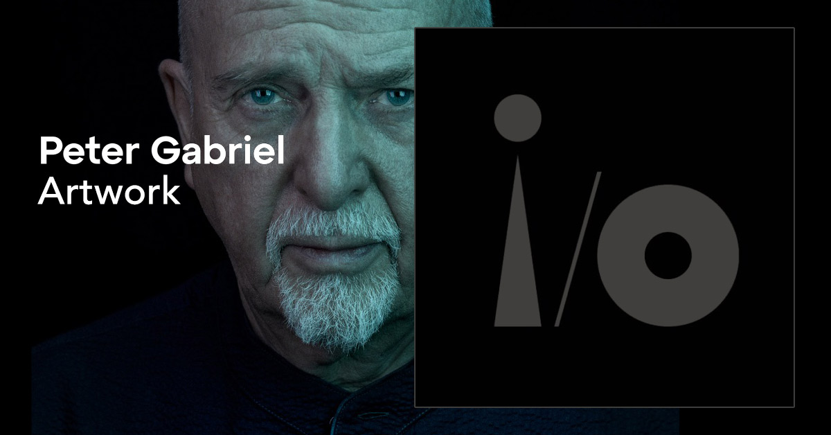
For the release of i/o, Peter Gabriel again has each track accompanied by a piece of art. He had already done something similar with USand with black and white photo works with Up. In the case of US, the artists were given a demo tape of the song and the artwork was then created explicitly for this track.
For i/o, the artwork was gathered from around the world. "We've been looking at the work of many hundreds of artists", Gabriel says about this.
Visual art – paintings, sculptures (or even photographs) – seem to be important to him. He has long been interested in the interdisciplinary, and in the case of album-artwork, he has recently been using material from the field of science (think of the microscopic images of blood cells for the Scratch My Back project).
We introduce all the artworks, the artists and the backgrounds.
1 – David Spriggs: Red Gravity for Panopticom
2 – Tim Shaw: Lifting The Curse for The Court
3 – Annette Messager: Mes voeux (avec nos cheveux) for Playing For Time
4 – Olafur Eliasson: Colour Experiment No. 114 for i/o
5 – Cornelia Parker: Snap for Four Kinds Of Horses
6 – Ai Weiwei: Middle Finger In Pink for Road To Joy
7 – Henry Hudson: Somewhere over Mercia for So Much
8 – Barthélémy Toguo: Chroniques Avec La Nature for Olive Tree
9 – Anthony Micallef: A Small Painting Of What I Think Love Is for Love Can Heal
10 – David Moreno: Conexión De Catedral II for This Is Home
11 – Megan Rooney: And Still (Time) for And Still
12 – Nick Cave: Soundsuit for Live And Let Live
All the information flowing…
Release #1 from 6 January 2023: Panopticom
The first release from i/o is Panopticom in the "Bright Side Mix". It is about the possibility of making the information on all kinds of topics available in the world (some of which is not visible) accessible for everyone. Gabriel envisions a globe into which one can zoom in to retrieve data – the Panopticom. The freedom of information achieved in this way then stands in opposition to the control and denial of information.
The Artist
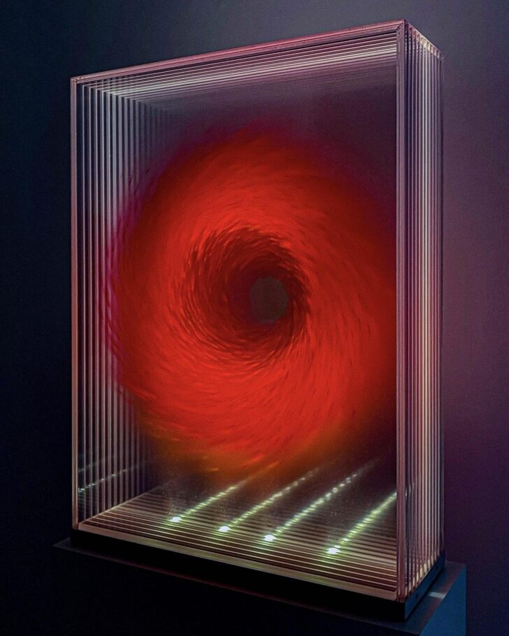
The accompanying artwork was created by David Spriggs. Born in Manchester in 1978, he moved to Canada when he was 14 and graduated in painting and sculpture from the Emily Carr Institute of Art & Design, Vancouver in 2000. He spent parts of his studies at the Bauhaus in Weimar and in Berlin. He has exhibited internationally and received awards. David Spriggs describes his work as a hybrid of painting, object and installation, in which individual sheets of Plexiglas are individually airbrushed and then layered one behind the other. The results can sometimes be as large as an entire room and have a three-dimensional effect.
This is not only about illusion, but also about raising the question of how we assemble the apparent forms in our minds, such as the three-dimensional effect of planar picture planes. Spriggs virtually undermines the illusion by allowing the viewer to look sideways at the objects and also see the layers individually.
Gabriel also says, "Part of what he does is imagine what art might look like a few years in the future and then try and create accordingly." Spriggs adds, "I think the future of sculpture will have a strong relation to the immaterial and to transparency and so many of my works are about this." Often they have a futuristic, otherworldly appearance. Yet, as Gabriel says, they also seem to be influenced by nature. "But," says Spriggs, "really it is about deeper philosophy and contemporary issues."
And he finds that his art, which is, after all, motionless, "still", is a good counter-statement to all the movement in the fast, multimedia world.
Many of his worthwhile works can be found on his website: www.davidspriggs.art
The Artwork
Panopticom is accompanied by the work Red from Spriggs' series Gravity from 2019 – acrylic on layered Plexiglas in an LED-lit Plexiglas showcase (84 x 61 x 20 cm).
As is actually always the case with him, the figure created through the layers is abstract rather than representational. In the case of Red, a left-turning swirl in red circling around an open "storm eye". This circling around a centre already appeared in Gabriel's explanation of the song: In the complete opposite of his "Panopticom", namely the concept for a prison that is built in a circle and thus a single guard can supervise many cells. Gabriel wants to achieve the reversal of this.
The Connection
Gabriel himself explains: "It was the theme of surveillance that connected me with the work of David Spriggs because he'd done a piece relating to that."About the Gravityseries, one can say that there is a force that revolves around an interior and forms a kind of vortex within it. This certainly relates to the intention of Gabriel's song.
But the association "eye" also fits: The all-observing as the form of power. Spriggs chose red because it often signals "warning" in perception.
Other works by Spriggs are aptly titled Axis of Power, Contact, Data, Hierarchy, Idiologies or Vision. The challenge for the viewer is to reconcile these titles with what is to be seen, which is never at first sight figuratively narrative.
Finally
For us, a few questions remained unanswered – but David Spriggs was kind enough to answer them for the Genesis Fan Club:
How did the contact with Peter Gabriel and his team go?
– Peter reached out to me as he really liked my work. After two long conversations over the phone about both my work and his, I thought that my work Red Gravity would be most conceptually perfect for the song Panopticomand proposed it to him. He loved this artwork and went with it for the song. Red Gravitywill be now become part of Peter's art collection.
How long ago was the first contact?
– It was not long time ago.
Have you heard the song beforehand?
– Yes, I heard Panopticommany times before suggesting my artwork Red Gravity. I fortunately learnt all about the song from discussions with Peter. It's complex and intelligent. I'm really pleased to have my work used for it as it's a great song.
How important is it to you to trigger political and social reflection with your works?
– I want people to think of larger things. Artworks that are just about itself are 'Art for arts sake'. It is so much more interesting for an artwork to inspire and make us think beyond the materials it is created with.
Peter Gabriel also published a video in which a little more is said about the background and David Spriggs himself has his say:
Release #2 on 5. February 2023: The Court
The Track
The second i/o track is called The Court and deals with justice and legal systems, how much they are exposed to error and abuse and yet remain necessary for a civilised society. Order and chaos are told in quite open associations, without anything like a closed story in it. Confusion is described in confusing images.
The Artist
Tim Shaw was born in Belfast in 1964 and studied art at Manchester Polytechnic and Falmouth School of Art. After working briefly as a restorer of buildings and works of art, he began to devote himself entirely to sculpture.
He creates sculptures with a figurative-naturalistic approach, which is then continued in an alienated way. Most of them are human-like figures in bizarre, partly over-realistic staging. Some of his sculptures are quite small and fit several on a tabletop, but often they are enormous. Some have mechanical mobility up to a fully executed animatronic (The Birth Of Breakdown Clown).
The themes he addresses are political, accusatory, put fingers in wounds, deal with terrorism or the war in Iraq. The installation Casting A Dark Democracy from 2007, which took up a famous photograph of a prisoner at Abu Ghraib, was praised.
Tim Shaw is quite renowned in Great Britain and has also received public commissions (for art in inner-city squares, for example).
The extensive website of Tim Shaw: www.timshawsculptor.com
The Artwork
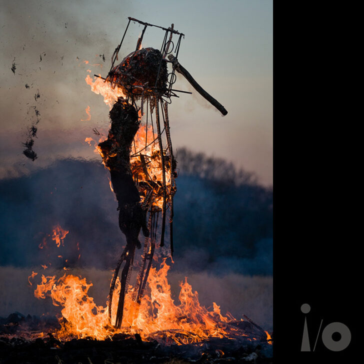
For the cover image of The Court, a work was chosen (actually: a photograph of it) that has a history that at first glance might seem a bit wacky.
It is a direct response to the artist duo Gilbert and George, who learned of plans not to exhibit their work in early 2021 and became incensed: "We herewith return our medals and certificates… We curse the Royal Academy and all its members."
Tim Shaw found, "Whether these are flippant words or targeted toxic energy, it's a serious business to curse someone. As one of the cursed, I feel an obligation to address this act with a robust response."
His art object for this was, first of all, a human-like figure about three metres tall, made of a metal frame with branches tied to it, fabric and a belly full of charcoal. At the end of the Royal Academy Summer Exhibition in January 2022, a ritual ceremony took place in which the sculpture was set on fire in a field and the remains were then scattered along the river to air, water and earth to transform the negative forces into positive ones.
The story with the curse and the shamanic ritual may sound crazy, but Tim Shaw's work is more clearly rooted in the real world than this background might at first make you think. Gabriel says Shaw's work is about the brutality we do to each other. And he finds rituals fascinating because they tell us a lot about ourselves.
Here some more images of the sculpture
And of the burning ritual
The Connection
At first, Gabriel only knew the photograph and then later learned about the story behind it. He was fascinated by the image of this strange figure that was burning – perhaps it had been condemned.
Together with the background narrative, however, the artwork makes sense for The Court. Both are about injustice, atonement and compensation. But you can feel the connection to the track more than think it – the song-lyrics work in a very similar way.
Tim Shaw comments: "I don't know why that particular image was chosen for this track, but thinking about it, it could be that when you look at the figure perhaps it stands there to be accused, judged and in this case it's burnt as a punishment process that takes place."
Once again a short video documentary on Tim Shaw was published (on 3 March).
Release #3 on 7. March 2023: Playing For Time
The Track
Playing For Time is about living, dying and the memories you collect along the way. That only memories make us who we are. That what you love is inside you. And it's also about the fact that this collecting is quite tedious. That we are all somehow "playing for time".
The Artist
Annette Messager is a painter, photographer, installation artist and was born in France in 1943. Someone older than Gabriel for a change. He has known Messager's work for "40 or 50 years" and almost had her on the art project for the US album back then.
Messager is best known for her installations, which often incorporate photographs, prints and drawings, as well as methods traditionally associated with female handicrafts. Knitting, for example, then becomes an artistic form. At the same time, her works have an enormous range and do not immediately suggest that they come from the same artist. She herself says in general: "My works are based on materials that are familiar to everyone. The fact that strange things are conjured from them creates an uneasiness."
And indeed, early on, she caused disturbance among the public, even rejection, for example with photographs of injuries from plastic surgery, embroidered misogynistic proverbs and tattered stuffed animals, remodelled into cute monsters.
It was not until late that she achieved worldwide recognition, meanwhile exhibiting at Documenta in Kassel or the Biennale in Venice, for example, and receiving numerous prizes. Today she is the grande dame of the French scene and is regarded as a pioneer of female art – with a lot of humour and feminine composure.
What is interesting for today is that she apparently does not have her own homepage. As a substitute, the website Archives of Women Artists is linked here with some impressions of her work.
The Artwork
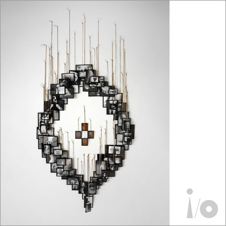
Playing For Time is accompanied by Messager's work entitled Mes voeux (avec nos cheveux) [English: My wishes (with our hair)]. Black and white photographs hanging from the wall on strings show parts of human bodies: hands, eyes, ears, pubic areas of women and men. In the middle, four pictures in beige-brown tones, less concrete. In fact, the frames contain hair.. Hair is something kind of weird. […] You can cut it, you can make it curly, you can change the colour – it's always the same body.")
The whole thing seems like a collage, like fragments of something bigger that never becomes visible. Perhaps they are votive offerings – symbolic sacrifices to a higher idea. Incidentally, in the overall arrangement of the individual photos, one might be able to see a vagina.
There are several versions of the work (one hangs in the Centre Pompidou), but the individual images and the arrangements are always different.
The Connection
Gabriel sees many of Messager's works as being characterised by the assembling of memories and pictures. Mes voeux (avec nos cheveux) perhaps shows longings, in any case gathers facets from which something whole can emerge, perhaps it remains a search for it.
Playing For Time is also about facets, memories that are sought throughout a lifetime. They represent what makes us tick – even if that is not always immediately recognisable. Perhaps never to be understood. But whether or not – in the end, time wears the crown.
Finally
It is perhaps interesting that the track was set to E "explicit" on Apple Music. However, this is not due to the lyrics of the song, but probably to the cover artwork, which shows explicit nudity.
Incidentally, the illustration in the Uncut article indicates that another work by Annette Messager was originally intended for Playing for Time: a clock face watercoloured in grey tones from the series L'homme qui marche à l'envers du temps [English: The man who walks backwards through time]. This change was probably a last-minute decision.
Finally, it is regrettable that after there were in-depth videos on the first two i/o artists, this was not continued after the third track (an interview with Annette Messager was announced but never appeared). One can only speculate about the reasons.
Release #4 on 6. April 2023: i/o
The Track
i/o is a song about interconnectedness. That everything is connected. We are made of atoms and biochemistry. In order for us to grow, material is put into us – and also comes out again. And when we eventually pass away, the atoms remain and become something else. There is a kind of life force that never leaves the universe. Gabriel finds that this insight can give understanding – for life itself, nature and fellow human beings.
The Artist
Olafur Eliasson, born in Copenhagen in 1967, is a Dane of Icelandic origin. In his youth he was a professional break dancer before he began to study art. He moved to Berlin in the 90s and founded the Studio Olafur Eliasson, which today carries out projects spanning several disciplines, not only in the visual arts but also in architecture, film, programming and even cooking.
Eliasson uses technical equipment and natural elements such as light or water to create sculptures and large-scale installations. His main themes include human perception and our relationship to the environment. For The Weather Project (2003), he installed a huge "artificial sun" in the Tate Modern. For Ice Watch (2014), he melted large blocks of glacial ice in London, Paris and Copenhagen. Both projects aimed to raise awareness of climate change.
He himself says: "My work reflects on 'how' and 'why' we see things rather than 'what' we see." He often straddles the line between art and science.
Works by him stand or have stood in Munich, Frankfurt, Vienna, New York or Reykjavík. In 2003, he represented Denmark at the Venice Biennale.
From 2009 to 2014, he was a professor at the Berlin University of the Arts.
His project Little Sun achieved great fame. Small yellow lamps made of recyclable plastic with rechargeable batteries powered by photovoltaics are intended to give people an artificial source of light in regions where there is still no electricity. Or a clean source of light to other people. What sounds like a simple concept has more background than it seems at first.
The Artwork
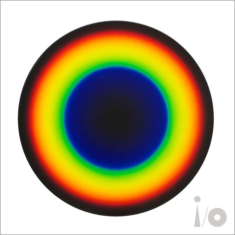
…is called Colour Experiment No. 114, is from the year 2022, a round painting, oil on canvas, diameter 80 cm. It shows a dark circle in which a wide ring stands, reproducing the rainbow colours from the inside to the outside – whereby the violet, which is on the very inside, is barely discernible and the yellow area has the greatest width.
As the title suggests, Olafur Eliasson has created a whole series of works of this kind. They are very different in appearance, do not all show a rainbow scale, but encompass the most diverse colour schemes. However, they are all united by the circle as a form.
In 2009, Olafur Eliasson began these paintings, which are partly inspired by the idea of mixing and applying an exact shade of colour for each nanometre of the visible light spectrum, whose frequency ranges from about 390 to 700 nanometres. Eliasson has created quite a few of these paintings, varying greatly in size and expression. The colour palette of some other pieces of the series is taken from certain sources, for example historical paintings by J.M.W. Turner or Caspar David Friedrich or photographs by Eliasson.
When asked about this, he says: "Geometrically speaking, a rainbow is actually a circle that only appears to be an arch because of the horizon line. If the earth did not block our view of the rainbow, it would appear as a full ring – much like the subject of these paintings. Each of the canvases features a circular band of colours that progresses from red through orange and yellow to green, blue, and indigo – the tones that make up the prismatic spectrum. In contrast to the black background that dominates the majority of the circular canvases, the circular rainbows, like the ephemeral phenomenon that inspired them, seem almost to be made of light."
The Connection
…is not as obvious this time as it has been with the artworks so far.
Gabriel finds Eliasson to be "a mixture of artist, scientist and… magician", whose works encourage us to think about how we interact with our surroundings. This might also and especially refer to his preoccupation with the splitting of light. Eliasson's art, Gabriel says, in many ways represents what the song is about: That there is a force that never leaves the universe. It is always there, but it transforms.
Eliasson goes on to explain: "Both my work and the track are abstractions of ideas and feelings, and they represent a place in which one can look for things that are in the process of being articulated… Over the last two years, I have become increasingly interested in sound. […] I've, of course, always known and respected Peter for his commitment to sound and a non-commercial approach to creating music. For a musical layman like myself, this strikes me as a preciously rare trait in today's audible landscape, and so it's something I would gladly be a part of."
Finally
Apart from his art contribution to the album, it is also planned for the i/o Tour (status: beginning of April 2023) that Eliasson will contribute a light object for the stage show. The planned element, which is still being experimented with, is – according to Gabriel – simple but beautiful. It will again split white light into the colours of the rainbow – but this time not through a prism, but through a "long strip of mirror in an elliptical dish". What that will be exactly, whether it will actually be used on the tour, remains to be seen.
Release #5 on 5. May 2023: Four Kinds Of Horses
The Track
Four Kinds Of Horses comes across with restrained tension throughout its course, which becomes increasingly dense. It is about the disastrous overlap that can arise in organisations and religions between peacefulness and violence. The title is based on the Buddhist parable of the four kinds of horses, which stand for different paths that are possible for a student's spiritual learning. The song then hints at a fifth one – one who thinks of himself as different, but who also only repeats everything again.
The Artist
Cornelia Parker was born in Cheshire in 1956, studied at Gloucestershire College of Art and Design (1974/75) and Wolverhampton Polytechnic (1975/78). She lives and works in London. In addition to major exhibitions in Boston, Turin, Stuttgart, Birmingham or Lima, some of her works can be found in the MOMA (New York), the Tate Gallery or the M. H. de Young Memorial Museum (San Francisco).
Parker employs numerous methods, such as exploding, squeezing, stretching, in order to wring new associations out of materials that are laden with subjective-personal sensations.
Her best-known work is certainly Cold Dark Matter: An Exploded View (1991). For this work, Parker had a garden house and its furnishings blown up, hung the remaining fragments from the ceiling and dramatically illuminated them from the inside with a single light. This created bizarre shadows on the walls. On the background, she said, "The history of sculpture has always been about violence, whether it's hitting stone with a hammer and chisel or forging metal." And, "Living in London in the eighties and nineties meant living with the constant threat of IRA bombs."
For a very different work, Thirty Pieces of Silver (1988-89), she had silver tea sets, plates and cutlery flattened by a steamroller and then hung them up too. "I've always been drawn to damaged, imperfect things. They convey a sense of drama and anxiety."
Basically, Parker also works a lot with the themes of light and cast shadows.
She was originally considered (as was Tim Shaw) for the art project for the US album. But it didn't work out for her either.
The Artwork
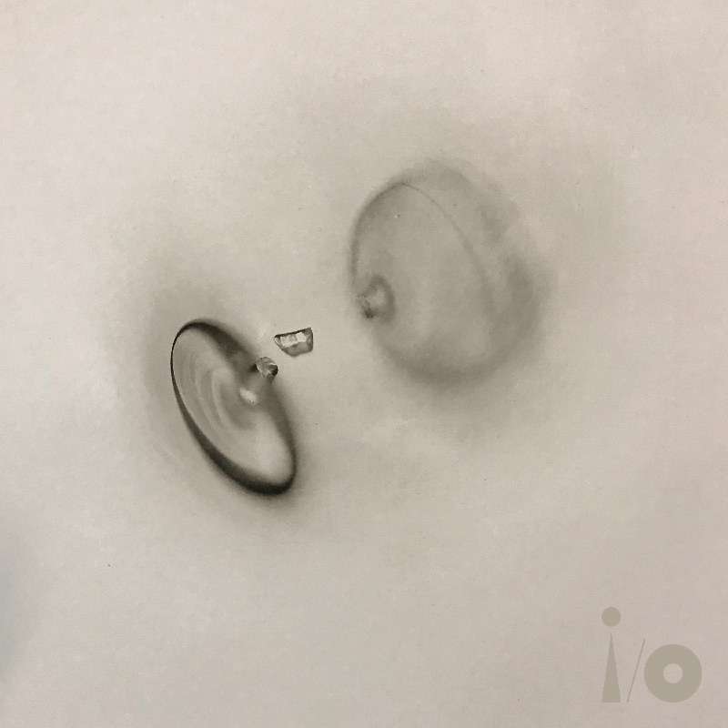
Gabriel chose a very different kind of work to add to the i/o collection. Snap is from 2020, measuring 32.6 × 30.4 cm as a print – and shows the contours of a broken wine glass quite blurred on a pale background in beige-grey. You can make out the bottom piece, a small part of the stem, as well as the actual semicircular glass body, which seems the most blurred.
There was a whole exhibition of prints of this kind by Cornelia Parker in 2020. The photographic technique behind them is inspired by the work of the pioneers of 19th century photography, namely William Fox Talbot.
Parker places objects on a chemically coated plate and shines ultraviolet light on and through the objects at oblique angles. On the copper or steel plate, this leaves changes on the light-sensitive polymer layer, which can be treated to create a deep relief similar to an etching. From this, in turn, impressions can be made on paper – the so-called photogravure process or polymer gravure etching. Our image for Four Kinds Of Horses is the print from such a plate.
So to put it more clearly: in the case of Snap, the sharply visible fragments of the wine glass lay directly on the exposure plate, while the parts rising further above it only produced a blurred image. So basically, the shadow cast by the objects can be seen on the print.
The Connection
With Parker's work revolving around destruction, recasting, light and shadow, it is not surprising to come up with an associative connection from the song.
Quite simply, Gabriel also says: Is "is the image that I fell in love with" and the "stuff around the broken glass seemed to fit with the song".
After all, the image shows destruction in a seemingly quite harmless, insignificant way – but nevertheless there is brutality in it. Perhaps one can also sense sadness for the transient in it.
As the May video for Four Kinds Of Horses suggests, by the way: Gabriel seems to be playing with the effect of light and shadow casting in the upcoming show as well.
Release #6 on 4. June 2023: Road To Joy
The Track
When you hear the lyrics of Road To Joy, you first think it's about sex. But Gabriel explains that the track is actually about a person in a coma who comes back to life after periods of absolute motionlessness. "It deals with near-death experience and locked-in syndrome situations where people are unable to communicate or to move. It's an amazingly frustrating condition."
The Artist
Ai Weiwei was born in Beijing in 1957. He studied animation at the Beijing Film School and then spent around ten years in New York, where he briefly attended the Parsons School of Design and the Art Students League. From 1993, he lived and worked in Beijing again.
In his work, Ai Weiwei engages in diverse forms of artistic expression, creating paintings, photographs, installations, sculptures, books, films and buildings, among other things, and also regularly participates in performances. He criticises the violations of human rights, economic exploitation and environmental pollution in his country, examines the connections between the modern world and Chinese culture, and also uses traditional objects, antiques or spiritual objects for this purpose. He often questions authority.
His best-known works include Sunflower Seeds (2010), for which he had 100 million hand-painted porcelain sunflower seeds made by Chinese artisans and spread them across the floor of the Tate Modern's Turbine Hall.
In 2008, he worked as a consultant on the "Bird's Nest" stadium for the Beijing Olympics; he later described the project as a "fake smile of bad taste".
Ai Weiwei first suffered police persecution from 2009 onwards after making anti-government statements; he was arrested in 2011 and held for 81 days without regular charges. Governments and artists from all over the world protested against his arrest. He was also banned from travelling until 2015, then left the country as soon as he could. He lived in Berlin until 2019, then in England and since 2021 in Portugal.
Ai Weiwei is one of the best-known representatives of contemporary Chinese art and participated for Germany in the 55th Venice Biennale in 2013. Works by him are or have been shown in the Centre Pompidou, the Los Angeles County Museum of Art, the Guggenheim Museum or the Tate.
Ai Weiwei is probably the most renowned artist in the i/o collection so far.
The Artwork
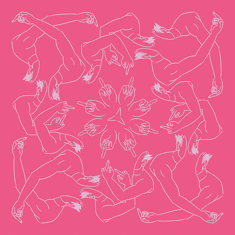
The image is called Middle Finger In Pink (2023, two-colour silkscreen on paper, 60 x 60 cm) and is one of three colour variations. Its motif goes back to Ai Weiwei's photo series Study Of Perspective with photographs that show, from a subjective point of view, his outstretched arm with raised middle finger in front of various backgrounds. For example, the gate to the Forbidden City in Beijing, the White House or the Reichstag in Berlin. The pictures are usually interpreted politically because of Ai Weiwei's efforts to promote freedom of expression. The provocative gesture is meant to relativise what is supposedly above one.
This is currently being taken up by an art project of the Avant Arte society: On the project's Website, visitors can digitally place Ai Weiwei's fingers in front of their own locations.
Derived from this basic idea is now a graphic that repeatedly shows the "stinky finger" alone or with an arm and a suggested upper body attached to it. The rather clear number of individual elements is arranged repeatedly or mirrored in such a way that an intricate circular graphic is created. It can be seen as tangled or as a kind of mandala.
In Gabriel's live shows, this illustration is also shown animated on the screens.
It is also noticeable that no i/o logo has been inserted for use as a song cover this time. This would have interfered with the image motif.
The Connection
If Ai Weiwei's finger is directed against the authoritarian, against the overpowering, then it is – according to Gabriel in reference to his piece – death to which the man waking from a coma gives the finger. With this view, he now uses the motif.
Ai Weiwei says in the video for the song about his collaboration with Gabriel in general that "art and music is the same thing – you cannot really seperate human expressions as different vehicle or different media, but it's the same."
A notable, though probably accidental, coincidence is that Ai Weiwei and Olafur Eliasson – the artist to the April track – designed a project together called Moon. It offered people around the world the opportunity to connect online through a collaborative drawing platform. International borders were crossed for creative expression and interaction.
Release #7 on 3. July 2023: So Much
The Track
So Much is about "so much" you want to achieve in life, but for which there is also only "so much" amount of life available. It's a song about aging, about choices and about the boundaries of possibilities. In a way, it is also about infinity and limits.
Musically, the song is unagitated, provided with thoughtfulness, quite consistent and occasionally also takes on an almost sacral effect.
The Artist
Born in 1982, Henry Hudson will be the second youngest artist in the i/o catalogue. Remarkably, he was born in Bath. But Gabriel and he did not know each other, and only met recently. Hudson grew up in Yorkshire and later took degrees in art and design in London.
He creates paintings, sculptures, etchings and performance works. He explores notions of Britishness, satirising social stereotypes and the vulgarity that can arise from wealth, fame and consumer culture.
In 2015, he had a successful exhibition in London of paintings that were a modern adaptation of an 18th century series of paintings depicting the moral failings of a young English rich man. The paintings are garish, richly detailed, grotesque, thoroughly surreal.
Hudson is also known for his use of plasticine in his paintings. He uses it to give them a formal surface that goes beyond the usual pastos of thick paint application. He says: "There are certain things you can do with plasticine that you can't do with paint."
The Artwork
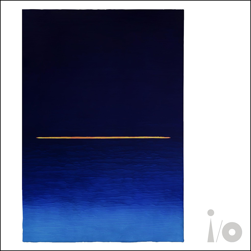
The painting for the July track is titled Somewhere Over Mercia and belongs to Hudson's Horizon Lineseries, which is (not for the first time in the i/o collection) quite different from the artist's previous works. The paintings of the series always show different shades of colour, with a line going (mostly) horizontally through it. They are reduced and not representational.
The beginning of this series lies in the time of the Covid lockdown, when Hudson sat in an airliner and was almost alone in the large cabin. This unusual situation opened up a special perception for him and as he looked down on the earth out of the window, identity and individuality disappeared for him. What remained was a sense of vastness and higher-level things.
Hudson sees the series as landscape paintings from a great distance. The titles of the individual works always refer to a particular part of the world. "Mercia" here is an ancient name for a region in central England (it goes back to a lost kingdom) where both Hudson and Gabriel were born.
Somewhere over Mercia has also a layer of plasticine, to which blue pigments have been applied. You can see the uneven surface in higher resolution views of the image. The "horizon line" is cut into the plasticine and shows the yellow and red layers underneath, which only emerge in this way.
The Connection
The song looks at life and tries to sort out what is really important. It tries to make out the big, whole picture.
"It's very hard to judge anything when it's so close," Hudson reasons. "You need perspective. You need a horizon line." And: "The relationship between that song and my horizon lines are quite poignant. […] Dealing with places that can appear to be closer or further away."
Gabriel adds that the horizon indicates the beginning of infinity – and at the same time a limit.
Release #8 on 1. August 2023: Olive Tree
The Track
Olive Tree tells of a journey into the world of thoughts. Into the world of nature, plants, water, life. Soon it will be possible, says Gabriel, to make use of an electrode helmet to convert brain waves into video images. And perhaps also to understand other, non-human life forms – maybe to find a connection with them.
The song follows someone who steps into another world and experiences it in all its vitality.
The Artist
Barthélémy Toguo, born in 1967 in M'Balmayo in Cameroon, is a painter and installation artist. In the 90s he studied successively in Abidjan (Ivory Coast), Grenoble and Düsseldorf.
His themes are migration and exile, environmental hazards and epidemics – but by no means gloomy and accusatory, otherwise inviting or even humorous. He works with a variety of media including painting, photography, print, sculpture, film and perfomance.
Toguo says, "Men or women are always potential exiles, driven by the urge to travel, which makes them 'displaced beings'."
In Transit (1996), Toguo gave a series of performances at airports and train stations where he irritated security checks by carrying bags carved out of wood.
The installation The Road to Exile (2008) addresses the migration and refugee crisis, in particular the flight of young Africans with hopes for a better life. On view is a small wooden barque, towering with thick bundles loaded with colourful bales of cloth. The journey becomes a fragile, dangerous affair.
In the country of his birth, Toguo has also renovated Bandjoun Station – an old railway station that is now an artist's residence and meeting place, library and organic farm.
Finally, he has also created a series of large-format paintings in ink on canvas.
They show plants and tendrils in strong blue, in between human-like figures with animal forms. The paintings seem primordial and achaic, like ancient petroglyphs on rocks, but also playful, symbolic and surreal.
Barthélémy Toguo is considered one of the outstanding artists of the African art scene. He was Artist in Residence at WOMAD in 2015, was named a UNESCO Artist for Peace in 2021, lives and works in both France and Cameroon.
The Artwork
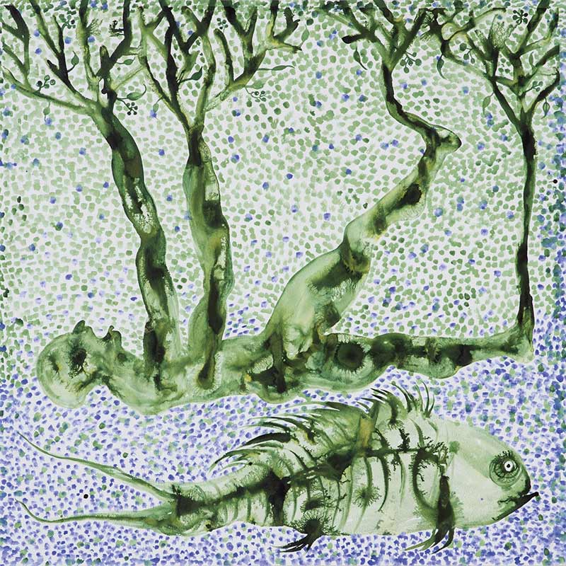
Chroniques Avec La Nature is a large-format ink drawing, watercolour gradient, in matt green and blue. It shows a human figure lying on its back, its arms and legs extending into tree structures, trunks and branches. Below this is a fish whose fins look unusually shaggy – like fur. Bone structures can also be seen. Nevertheless, it should not be meant here that the fish is dead.
The background of the picture is only indicated by many dots. In the upper part they are mostly in the same shade of green as the main motifs, in the lower third it's blue, possibly suggesting water (in which the fish would then swim).
The Connection
Toguo made the painting explicitly for the song, which is the exception in the i/o project. But he wanted to give something that directly responds to the music.
Toguo's theme is travelling, migrating, crossing borders, blurring borders. And here, as in the song, the borders between man and plant, world and water become blurred.
In Olive Tree we also hear African music motifs most clearly on i/o so far. Choosing an African for the accompanying graphics makes sense on this level as well.
Release #9 on 31. August 2023: Love Can Heal
The Track
Musically, the track has a meditative-repetitive structure and in the lyrics it makes the plain statement: love can heal. A simple thought, but one that is important to Gabriel and also picks up on central themes of i/o: Interacting and connectedness with everything. Love Can Heal conveys sympathy in a lost state – and encouragement.
The Artist
Briton Antony Micallef was born in Swindon, England in 1975 and studied art at Plymouth University. He essentially makes oil paintings, charcoal drawings and prints, occasionally also sculptures.
For a long time he dealt with the darker side of our consumer society, juxtaposing cultural icons and motifs with smeared, human-like forms; simple, almost comic-like images with a disturbance factor.
He also produces black and white etchings with an expressive, mysterious appearance that trace the existence of man and his emotions.
Recently he has been making self-portraits as wild, raw paintings with enormously thick paint application. Radical representations of a sensibility.
Well-known became his project Trump Fag Packets of 2016, in which he painted Donald Trump's face on Marlboro cigarette packs. Occasionally, it is then written above the warning labels, such as "seriously harms you and others around you".
Micallef is considered a modern expressionist and is known for his "visually charged figure paintings" and a political visual language that he himself calls "critical pop". However, the force of his pictures is also very disturbing. He has gained worldwide recognition for his work and has already exhibited at the Royal Academy, the National Portait Gallery and the Tate Britain.
His webside gives an impression of his diverse oeuvre.
The Artwork

The painting for the track is called A Small Painting Of What I Think Love Is (2010, oil on cardboard, 29 x 21cm) and shows two human figures in black and white, holding each other intimately. They are only roughly indicated, yet clear in appearance and strong in expression.
It should be quite remarkable that an artist whose work stands primarily for force and drasticness is able to create something so intimate.
Micallef apparently painted the picture quite quickly, in a happy sweep in which it "seemed to arrive on its own".
The motif has also been used in live performances during the i/o Tour, for which animations were created together with Aardman Studios, which have now also been released as a stand-alone video (see below).
The Connection
It should not be difficult to see a closeness between the two figures holding each other intimately in the painting and the soothingly embracing song with its message.
Micallef had chosen this work for Love Can Heal because he found that the two threaded together perfectly: "I was listening to a few of the songs and it's interesting because it's like putting on clothes and going 'oh, this suits me' or 'that doesn't suit me.' With Love Can Heal I could see my images coming up when I was hearing it so you begin to home-in and that's how it starts."
The Video
Love Can Heal is the first song of i/o for which a video clip was originally made (means: which was not found in the submissions to a competition).
The painting by Micallef was taken as the central motif and brought to life by Aardman Studios (with whom Gabriel has worked on several occasions). Micallef was involved in the whole process.
Paint drips onto an empty surface. Black and white layers move and shift in pulsating animation. Out of this forms the two figures holding each other. Later, the black expands as if diving into a deeper layer. There, the couple appears in a closer view, appearing more three-dimensional. The control elements of the digital 3D models show themselves, the grid structures. The effort required to keep the two figures embraced becomes visible.
To the bridge with the visionary lyrics, the a beating heart appears.
Then it goes back to the figures. From the deeper, black level, it exits again until it ends with the empty initial surface.
The video radiates calm and thoughtfulness – and works with few pictorial motifs. But it is only seemingly simple.
Incidentally, it is reminiscent of the clip for Zaar, which also plays with painting in motion.
Release #10 on 29. September 2023: This Is Home
The Track
In This Is Home, no big story is told that develops. It is more about deep happiness and inner contentment experienced in a beloved place with a beloved person. Even though tribulations are not faded out: The song is characterised by serenity in both text and music.
The Artist
David Moreno was born in Barcelona in 1978 and studied architecture. After his graduation, he soon turned to artistic work and has been exhibiting in galleries and museums worldwide since 2006, for example in Paris, Brussels, Istanbul and London. He lives and works in Rotterdam and Barcelona.
Confusingly, you can also find the website of a painting artist with the same name from New York – but that's someone else.
Our Moreno works with wood, plastic, steel – and piano strings. From these he creates objects that look like sketches by an architect, in which buildings or groups of houses have been fleetingly sketched, but now emerge from the walls as metallic sculptures and expand into the room. They are lattice structures reminiscent of hatched drawing surfaces, outlining only what is necessary. It seems strangely weightless, strangely fleeting. And at the same time there is something homely – something familiar.
Some of these buildings also have wide curves that lead away from one end and back to it somewhere else. They can mean many things – thunderous impact, contact-making, self-initiation.
Occasionally, Moreno builds only parts of buildings – especially entrances and stairways that lead nowhere. Contexts have to be added here as well.
For an exhibition in the Arab Emirates, Moreno developed an object called Connecting Doors (2017): A room-sized, gate-like passageway in Moreno's lattice design that has the appearance of a medieval portal on one side and oriental forms on the other. This passageway literally creates a link between two cultures.
Moreno's art is on the one hand of decorative beauty, but also irritates, raises questions, does not explain everything to the end.
The Artwork
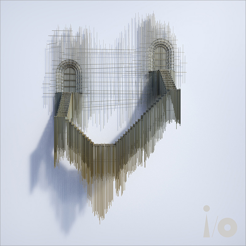
Interestingly, originally This Is Home was accompanied by another sculpture by Moreno, which he had made specially. It is also pictured in the i/o tour book. It is called La Vie En Rose and shows a house with arched connections from the entrance to the roof. But Gabriel, looking through Moreno's work again, thought the current object, with two doors and a staircase between them, was much better suited to a song that was about relationships.
The current sculpture is titled Conexión De Catedral II (English: Cathedral Connection II) and is made of steel wire welded in silver with a gold finish. It shows two gates with reveals in the style of medieval church portals. From each of them a staircase leads down to a landing, where they turn until both meet at the lowest point in another landing. The whole is executed in Moreno's typical style of lattice structures.
There are several variations of this basic concept (hence the two in the work's title). One of them has oriental passages instead of church-style portals. A motif that Moreno uses more often.
The Connection
Even though the song is called This Is Home, there is no complete house here (unlike in the original object) – only an important part is outlined: Entrances.
References to a song about relationships can still be told.
The portals are on different levels, one stands higher than the other. Perhaps they nevertheless belong to the same building. Perhaps there is only an apparent difference between them. The connecting staircases run over several steps, are perhaps arduous – but they create a connection.
But one can also simply find the sculpture pretty.
This artwork, by the way, is one of three that were not used in the visualisations of the i/o Tour. For This Is Home, this was true at least for the first leg of the tour through Europe. In America, the motif (as well as the originally chosen house) was included in the projections after all.
This may indicate that a work of art accompanying This Is Home was found quite late.
Release #11 on 28. October 2023: And Still
The Track
And Still is a song for Gabriel's deceased mother. Conveys being alone with thoughts, the memories of past touches, of the childhood home. And there is the statement to carry the mother inside wherever you go. Wistfulness and loss are expressed – but also deep love and gratitude.
Musically, the piece remains uniform, but has an underlying tension. It is divided into several sections, which as a whole also describe a small development.
The Artist
The penultimate in the round for the i/o collection is Megan Rooney. With a birth year of 1985, she is also the youngest.
She was born in South Africa, later grew up in Rio de Janeiro, but is actually Canadian. She studied art in Toronto and later in London and (like many of the i/o artists) works in various disciplines: In addition to painting, also in sculpture, installation, performance – and poetry.
Megan Rooney's art can be seen internationally, for example in Toronto, London, Paris, Warsaw and Düsseldorf. At the 57th Venice Biennale in 2017, she performed in the supporting programme of the Swiss Pavilion. In 2020, she designed the walls of the large hall and the ring gallery for the Salzburg Kunstverein. She lives and works in London.
Her paintings are mainly in the rather large format 200 x 152 cm. This corresponds to the arm span of most women. She mainly paints abstract colour landscapes, but one can read or recognise representational elements into them. In fact, for her there are stories and experiences in them – political but also everyday ones – which she translates through rapid, powerful discharges.
Roony's interest is very much in colours and what they trigger when you look at them. She says: "I think my colour sensibility comes from a northamerican upbringing. I mean, I was inicially born in Southafrica and then I moved with my family to Southamerica, to Rio de Janeiro, and then I grew up in the suburbs of Toronto (…). And this kind of pastel and beiges and browns and light and soft colours was kind of everywhere and this sort of affected how I start think about colours."
Finally, what's special about her work is that she repeatedly scrapes off and reapplies layers of paint, like looking beneath the surface and back in time. Because nothing stays or is forever.
The Artwork
The story about the painting that accompanies the song is a little special. It can be found on the internet under the title Dividing The Light (Rumblings).
In fact, Gabriel first approached Megan Rooney for the i/o art project. Together they initially chose this painting, but Rooney wanted to create something specifically related to the music and began to paint a new piece. At some point, however, it took her too long and she couldn't get any further (Gabriel shows understanding for this) and together they decided to use the picture they had already chosen.
In the i/o tour book, it is somewhat misleadingly depicted as if it was this painting that had been done in response to the music. But that is probably not true.
The title was then also changed, it seems, and now it is called And Still (Time) (2022, acrylic paint, pastel and oil pastels on canvas, 200 x 152 cm). It is painted in Rooney's usual format and shows an abstract composition in mainly blue and yellow tones.
The Connection
What one wants to see in the colour landscape is up to the viewer. A variety of associations are possible if one lets oneself in. Is there water? A pond in the countryside like the Gabriels? Or more sky, dark clouds and light? A black abyss that slowly closes in again?
The song goes into a recollection, goes into memories to the perceptions of the beginnings of a life. The fact that Rooney keeps abrading parts of her paintings goes back to the beginnings of the painting. Which in this way seems to have no defined end. But always a past.
It is interesting that for the stage projections at the i/o Tour, only very small areas of the painting were pulled up large onto the screens.
Release #12 vom 27. November 2023: Live And Let Live
The Track
Live And Let Live is about forgiveness. Gabriel says that peace only comes from respecting the humanity of others. If you keep thinking about revenge and paying back, you will be among those who have been hurt and remain hurt – and forgiveness is an effective way to free yourself from this.
The song dissolves dark feelings such as hatred and anger, and answers prejudgement with embrace.
The Artist
Nick Cave does not refer to the musician of the same name. Our Cave was born in 1958 in the USA (in Fulton, Missouri) and was originally a dancer. He then studied visual arts and increasingly worked in this field. He also maintained contact with movement theatre and performance.
Cave's works are predominantly mixed-media sculptures and large-scale installations for which he uses found objects and colourful fabrics. They often contain parts of black dolls or mannequins and create an altar-like appearance. In terms of content, they deal with racial tensions, in particular gun violence and its effects on people of colour.
One of these works is TM 13, a sculpture that responds to the death of Trayvon Martin (hence the title) in 2012. Martin was shot by a neighbourhood watchman for questionable reasons, who was acquitted later. Cave's sculpture consists of a hoodie, denim trousers, trainers and a black mannequin. They are conspicuously wrapped in a net that represents "a kind of soundsuit for the ghost of Trayvon Martin […] to protest against his undeserved demise".
Works by Nick Cave have mainly been exhibited in the USA, including at the Guggenheim Museum in New York.
Cave also teaches at the School of the Art Institute of Chicago.
The Artwork
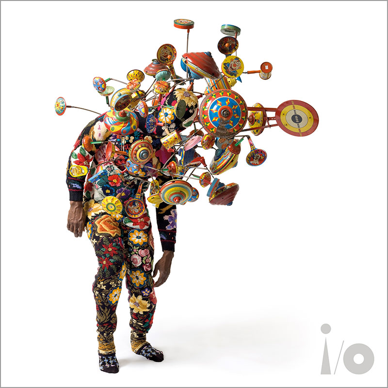
It is – yes, what? A jester's costume? A one-man band? An exploded toy shop? – Whatever: live and let live!
It's called Soundsuit and is part of a now enormous series of these art objects that Nick Cave has produced ("at least 500"). They have no individual names, are not designed by Cave in advance, but are created as he works on them.
Cave is essentially known for these soundsuits, which are so named because they make noises when they move. They are available in a number of basic shapes, which are quite different. The designs of these basic shapes being similar, but each one is unique. They can be used as art objects in exhibitions, but are also intended to be worn and used for performance.
The soundsuits had their origins in the early 90s, during the period of unrest following the murder of Rodney King by police officers. People of colour were (and are) often generally suspected in the USA. Cave wanted to counter this with something that would conceal any conclusions about the wearer and at the same time create a disarming kind of armour.
Our Soundsuit is from 2008 and consists of thickly knitted woollen fabrics in lively patterns. They are deliberately sewn together roughly and cover almost the entire body of the wearer. Many rods protrude from the upper half, with rattles, humming tops, rattle plates and other colourful toys attached to the ends. Just the sight of it gives you an idea that you can't move silently in this suit.
Incidentally, the photograph used by Gabriel can be purchased as an art print. And at least one other photograph of the session has been published. It shows the suit wearer leaning backwards with his body more erected.
The Connection
The Soundsuits conceal the race, gender and origin of the wearer and thus remove all possibilities of prejudgement. The only thing that counts is meeting each other openly. It is the same respect that inspired Live And Let Live.
In addition, the soundsuits spread a vital, optimistic mood – which Gabriel's song also undeniably has.
Incidentally, this artwork was one of the few that was not used in the design of the screen projections for the i/o Tour.
All the information flowing…
Finally, a few facts about the art for i/o
Artworks were created between 2008 and 2023.
Involved are 3 female und 9 male artists.
In 2023, they were between 38 and 80 years old (born 1943 up to 1985).
7 are from Europa (with 4 from Great Britain)
3 from North America (one from the USA)
one from Africa
one from Asia
All artworks were used for the screen projections of the i/o-Tour in 2023. This was not the case for i/o and for Live And Let Live. The one for This Is Home was used not before the North-America leg.
Three artworks also underwent minor changes to their presentation in the course of the album release. A different photo of the ritual ceremony was chosen for The Court. On it, the burning is slightly more advanced. The painting for i/o was given a black instead of a white background. And finally, the motif for Four Kinds Of Horses was rotated 90 degrees to the left. In addition, the basic colouring appears less beige and more grey. All these changes could already be seen in the tour book.
Author: Thomas Schrage